Group 2 Definition and Example
The reports from Group 2 include the following specific reports. Each will provide a detailed explanation of what information the report provides.
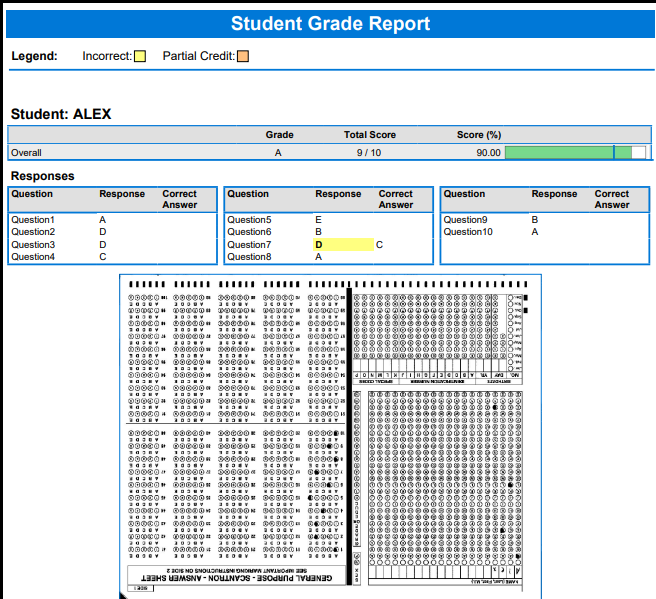
Student Grade Report
The Student Grade Report provides a detailed grade report for each student included in the grade operation. The report provides a summary of the students’ answers and grade information from the test. Incorrect responses are highlighted in yellow.
- If extra credit questions are included, they are highlighted in blue.
- If the forms were scanned with an OMR/Image scanner and you captured form images during scanning, images of the students’ tests appear with each report.
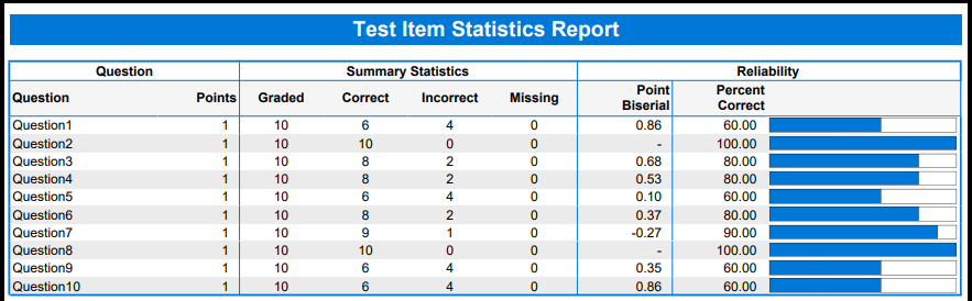
Test Item Statistics Report
The Test Item Statistics report displays descriptive statistics for each question on the test.
- While most of the statistics are self-explanatory, the Point Biserial may be an unknown statistic to most instructors.
- This is a measurement of the discrimination of an item. This indicates the relationship between a response for a given item and the overall test score of the respondent. The point biserial tells you if a question was a good discriminator between the better students and the poorer students. Point biserial ranges from -1 to 1. A positive value indicates that the students who did well on the test answered the question correctly.
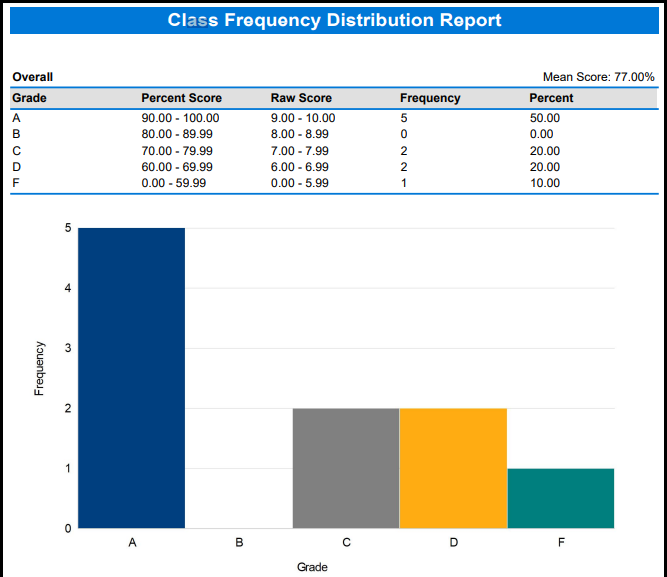
Class Frequency Distribution Report
The Class Frequency Distribution report displays the breakdown of scores for an entire class and the mean score. Below breaks down different aspects from the report:
- The table across the top of the report shows the Grades along with their corresponding Percent Scores and Raw Scores, and the Frequency of each grade.
- The Percent column shows the percentage of time that grade appears for the group of scores.
- The chart shows the Grade across the X-axis (bottom) and the Frequency of that grade along the Y-axis (left side).
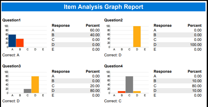
Item Analysis Graph Report
The Item Analysis Graph Report shows the distribution of responses for each question. It contains graphs that display the possible answers along the X-axis (bottom) and the frequency in percentage along the Y-axis (left side).
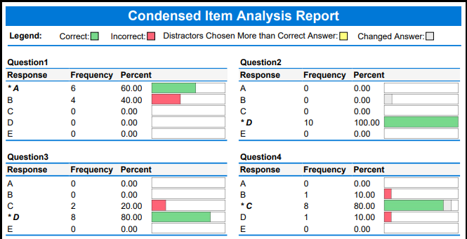
Condensed Item Analysis Report
The Condensed Item Analysis report displays the same information from the Detailed Item Analysis report but in a condensed fashion. A bar chart is displayed to the right of the table containing the statistics. The bar chart displays the correct response(s) in green and the incorrect response(s) in red. If an incorrect response is chosen more than the correct response(s), its bar chart is yellow.
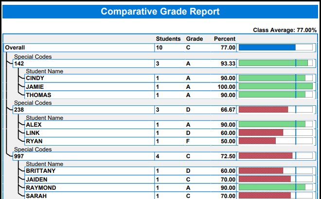
Comparative Grade Report
The Comparative Grade Report allows you to see test scores broken down by specific criteria. You can select identification responses from the data on which to base the report.
For example, this report is especially useful for comparing distinct groups. If your students mark a category such as “Special Code,” you can see their scores grouped together.